IN A WORLD of responsive and fluid layouts on the web ONE MEDIA TYPE stands in the way of perfect harmony: video. There are lots of ways in which video can be displayed on your site. You might be self hosting the video and presenting it via the HTML5 <video> tag. You might be using YouTube or Vimeo which provides <iframe> code to display videos. You might be using Viddler or Blip.tv which provide nested object/embed tags to display a Flash player. In each of these scenarios, it is very common for a static width and height to be declared.
<video width="400" height="300" ...

<iframe width="400" height="300" ...

<object width="400" height="300" ...
      <embed width="400" height="300" ...
Guess what. Declaring static widths isn’t a good idea in fluid width environments. What if the parent container for that video shrinks narrower than the declared 400px? It will bust out and probably look ridiculous and embarrassing.
So can’t we just do this?
<video width="100%" ...
Well, yep, you can. If you are using standard HTML5 video, That will make the video fit the width of the container. It’s important that you remove the height declaration when you do this, so that the aspect ratio of the video is maintained as it grows and shrinks, lest you get awkward “bars” to fill the empty space (unlike images, the actual video maintains it’s aspect ratio regardless of the size of the element). You can get there via CSS (and not worry about what’s declared in the HTML) like this:
video {
  width: 100%    !important;
  height: auto   !important;
}
Nội dung bài viết
<iframe> Video (YouTube, Vimeo, etc.)
Our little 100% width trick isn’t going to help us when dealing with video that is delivered via iframe. Setting a height is required, otherwise browsers will render the iframe at a static height of 150px1, which is far too squat for most video and makes for more R&E (Ridiculous and Embarrassing). Fortunately there are a couple of possible solutions here. One of them was pioneered by Thierry Koblentz and presented on A List Apart in 2009: Creating Intrinsic Ratios for Video. With this technique, you wrap the video in another element which has an intrinsic aspect ratio, then absolute position the video within that. That gives us fluid width with a reasonable height we can count on.
<div class="videoWrapper">
    <!-- Copy & Pasted from YouTube -->
    <iframe width="560" height="349" src="https://www.youtube.com/embed/n_dZNLr2cME?rel=0&hd=1" frameborder="0" allowfullscreen></iframe>
</div>
.videoWrapper {
	position: relative;
	padding-bottom: 56.25%; /* 16:9 */
	padding-top: 25px;
	height: 0;
}
.videoWrapper iframe {
	position: absolute;
	top: 0;
	left: 0;
	width: 100%;
	height: 100%;
}
But, but… aspect ratios, legacy content, non-tech users, etc.
The above technique is awesome, but it has several possible limitations:
- It requires wrapper element, so just straight up copy-and-pasting code from YouTube is out. Users will need to be a bit more saavy.
- If you have legacy content and are redesigning to be fluid, all old videos need HTML adjustments.
- All videos need to be the same aspect ratio. Otherwise they’ll be forced into a different aspect ratio and you’ll get the “bars”. Or, you’ll need a toolbox of class names you can apply to adjust it which is an additional complication.
If either of these limitations apply to you, you might consider a JavaScript solution. Imagine this: when the page loads all videos are looked at and their aspect ratio is saved. Once right away, and whenever the window is resized, all the videos are resized to fill the available width and maintain their aspect ratio. Using the jQuery JavaScript Library, that looks like this:
// Find all YouTube videos
var $allVideos = $("iframe[src^='https://www.youtube.com']"),

    // The element that is fluid width
    $fluidEl = $("body");

// Figure out and save aspect ratio for each video
$allVideos.each(function() {

  $(this)
    .data('aspectRatio', this.height / this.width)

    // and remove the hard coded width/height
    .removeAttr('height')
    .removeAttr('width');

});

// When the window is resized
$(window).resize(function() {

  var newWidth = $fluidEl.width();

  // Resize all videos according to their own aspect ratio
  $allVideos.each(function() {

    var $el = $(this);
    $el
      .width(newWidth)
      .height(newWidth * $el.data('aspectRatio'));

  });

// Kick off one resize to fix all videos on page load
}).resize();
Adding Vimeo
Vimeo uses iframes too, so what works for YouTube will work for Vimeo. The HTML/CSS technique doesn’t need any alteration at all, and the jQuery solution could be fixed changing a single line:
var $allVideos = $("iframe[src^='https://player.vimeo.com'], iframe[src^='https://www.youtube.com']"),
<object> / <embed> Video (Viddler, Blip.tv, etc.)
Some home-brew video embedding, as well as video sharing services like Viddler and Blip.tv, use old-school nested object and embed tags. YouTube also did it this was until fairly recently. It’s old-school and non-standard, but this technique was very widely used because Flash was everywhere and it just worked. Object/embed suffers from the same problem that iframes do, the width and height are required lest R&E results. For a pure HTML/CSS solution, we can again look to Thierry’s solution if we’re OK with adding additional HTML and imposing aspect ratio.
.videoWrapper {
	position: relative;
	padding-bottom: 56.25%; /* 16:9 */
	padding-top: 25px;
	height: 0;
}
.videoWrapper object,
.videoWrapper embed,  {
	position: absolute;
	top: 0;
	left: 0;
	width: 100%;
	height: 100%;
}
If we don’t want to bother with the extra HTML wrapper and CSS complications, we could again rely on JavaScript. Our script can remain largely the same, except we’re going to look for object and embed elements rather than video or iframe elements.
var $allVideos = $("object, embed"), And important to note: jQuery doesn’t allow the use of it’s .data() function on those types of elements, so we’ll need to use HTML5 data attributes2 to store and retrieve our aspect ratio data.
$(this)
   .attr('data-aspectRatio', this.height / this.width)

   ...

$el
   .width(newWidth)
   .height(newWidth * $el.attr('data-aspectRatio'));
Putting it all together
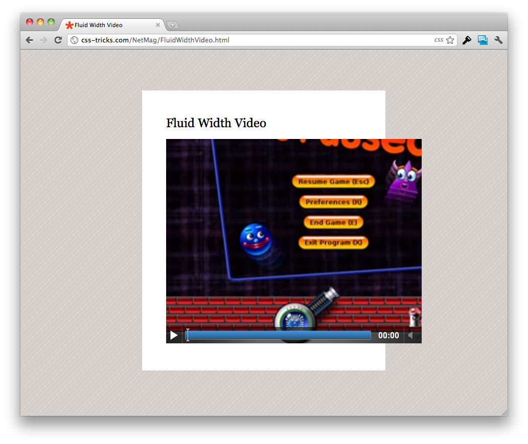
So let’s say we are in the position where we have lots of legacy content, which includes videos of all makes and models, and we’re redesigning our site to be fluid. The most efficient route is going to be combine everything we’ve learned in this article and put it together. See the demo page for the complete workings. View Demo
Tin tức nổi bật
Thiết kế web theo mẫu
Thiết kế web theo mẫu là gì? Thiết kế web theo mẫu là dịch vụ website được xây dựng...
Tổng hợp 20+ cách kiếm tiền từ website trong năm 2020
Thời kỳ 4.0, Internet trở thành một phần không thể thiếu trong cuộc sống của chúng ta. Người...
10 bước xây dựng kế hoạch marketing online
Thị trường luôn thay đổi và chính vì thế các chiến lược marketing online của bạn cũng cần...
Ý tưởng đặt tên thương hiệu – Cách chọn tên miền website – Lời khuyên vàng từ ITC Việt
Cách chọn tên miền website. Chúng tôi là ITC Việt. Chúng tôi là công ty thiết kế website...
Thiết kế website theo yêu cầu
Hiện nay Dịch vụ Thiết kế website theo yêu cầu đã không còn xa lạ đối với các doanh...
Thiết kế trang web, lập trang web, dựng trang web bán hàng
Nội dung bài viết Thiết kế trang web Thiết kế trang web là điều mà các công...
E-commerce là gì? E-business là gì? So sánh E-commerce và E-business
E-Commerce (tiếng Việt là thương mại điện tử) đang là một trong những vấn đề đáng quan tâm của...
Để thiết kế web đẹp bạn không thể bỏ qua 8 lưu ý sau
Việc thiết kế web ngày nay không còn dừng lại ở việc cung cấp thông tin đủ hay...