

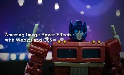
Ở phần 28 hiệu ứng hover tuyệt đẹp bằng css3 (Phần 1) mình đã giới thiệu tới các bạn 20 hiệu ứng hover với ảnh và text tuyệt đẹp ở phần 2 này mình tiếp tục giới thiệu đến các bạn các hiệu ứng hover có code phức tạp và nâng cao hơn.
Nội dung bài viết
21: Fading two images
CSS
.container {
position:relative; width:200px; height:150px;
}
.container img {
position:absolute; top:0; left:0; -webkit-transition: opacity 1.1s ease; transition: opacity 1.1s ease;
}
.container:hover .image1 {
opacity:0;
}
HTML
<div class="container">
<img class="image2" src="img2" alt=""> <img class="image1" src="img1" alt="">
</div>
22: Basic CSS3 image slider (without javascript!)
CSS
.container {
position:relative; width:200px; height:150px;
}
.container img {
position:absolute; top:0; left:0;
}
.container:hover img {
-webkit-animation-name: slider; -webkit-animation-timing-function: ease; -webkit-animation-duration: 10s; -webkit-animation-iteration-count: infinite; animation-name: slider; animation-timing-function: ease; animation-duration: 10s; animation-iteration-count: infinite;
}
@-webkit-keyframes slider {
0% {opacity:1;} 20% {opacity:0;} 80% {opacity:0;} 100% {opacity:1;}
}
@keyframes slider {
0% {opacity:1;} 20% {opacity:0;} 80% {opacity:0;} 100% {opacity:1;}
}
.container img:nth-child(1) {-webkit-animation-delay: 8s; animation-delay: 8s;}
.container img:nth-child(2) {-webkit-animation-delay: 6s; animation-delay: 6s;}
.container img:nth-child(3) {-webkit-animation-delay: 4s; animation-delay: 4s;}
.container img:nth-child(4) {-webkit-animation-delay: 2s; animation-delay: 2s;}
.container img:nth-child(5) {-webkit-animation-delay: 0s; animation-delay: 0s;}

HTML
<div class="container">
<img src="img5" alt="img5"> <img src="img4" alt="img4"> <img src="img3" alt="img3"> <img src="img2" alt="img2"> <img src="img1" alt="img1">
</div>
23: Advanced CSS3 image slider (without javascript!)
CSS
.container {
position:relative; width:200px; height:150px;
}
.container img {
position:absolute; top:0; left:0; opacity:0;
}
.container:hover img {
-webkit-animation-name: slider; -webkit-animation-timing-function: ease; -webkit-animation-duration: 10s; -webkit-animation-iteration-count: infinite; animation-name: slider; animation-timing-function: ease; animation-duration: 10s; animation-iteration-count: infinite;
}
@-webkit-keyframes slider {
0% {opacity:0;-webkit-transform: rotate(0) scale(0.5) skew(30deg,20deg);} 20% {opacity:1;-webkit-transform: rotate(0) scale(1) skew(0deg,0deg);} 30% {opacity:0;-webkit-transform: rotate(-360deg) scale(0) skew(0deg,0deg);} 100% {opacity:0;-webkit-transform: rotate(0) scale(0.5) skew(30deg,20deg);}
}
@keyframes slider {
0% {opacity:0;transform: rotate(0) scale(0.5) skew(30deg,20deg);} 20% {opacity:1;transform: rotate(0) scale(1) skew(0deg,0deg);} 30% {opacity:0;transform: rotate(-360deg) scale(0) skew(0deg,0deg);} 100% {opacity:0;transform: rotate(0) scale(0.5) skew(30deg,20deg);}
}
.container img:nth-of-type(1) {-webkit-animation-delay: 8s;animation-delay: 8s;}
.container img:nth-of-type(2) {-webkit-animation-delay: 6s;animation-delay: 6s;}
.container img:nth-of-type(3) {-webkit-animation-delay: 4s;animation-delay: 4s;}
.container img:nth-of-type(4) {-webkit-animation-delay: 2s;animation-delay: 2s;}
.container img:nth-of-type(5) {-webkit-animation-delay: 0s;animation-delay: 0s;}

.container .hovertext {
position: absolute; top:60px; left:30px; font-size:1.5em; color: rgba(255,255,255,1); -webkit-transition: all 0.7s ease; transition: all 0.7s ease;
}
.container:hover .hovertext {
top:20px; color: rgba(255,255,255,0); -webkit-transition: all 0.7s ease; transition: all 0.7s ease;
}
HTML
<div class="container">
<img src="img5" alt="img5"> <img src="img4" alt="img4"> <img src="img3" alt="img3"> <img src="img2" alt="img2"> <img src="img1" alt="img1"> <p class="hovertext">Hover here</p>
</div>
24: Shake it!
@-webkit-keyframes shakeit {
0% { -webkit-transform: rotate(0deg) translate(2px, 1px); } 10% { -webkit-transform: rotate(2deg) translate(1px, 2px); } 20% { -webkit-transform: rotate(-2deg) translate(3px, 0px) ; } 30% { -webkit-transform: rotate(0deg) translate(0px, -2px); } 40% { -webkit-transform: rotate(-2deg) translate(-1px, 1px); } 50% { -webkit-transform: rotate(2deg) translate(1px, -2px); } 60% { -webkit-transform: rotate(0deg) translate(3px, -1px); } 70% { -webkit-transform: rotate(2deg) translate(-2px, -1px); } 80% { -webkit-transform: rotate(-2deg) translate(1px, 1px); } 90% { -webkit-transform: rotate(0deg) translate(-2px, -2px); } 100% { -webkit-transform: rotate(2deg) translate(-1px, 2px); }
}
@keyframes shakeit {
0% { transform: rotate(0deg) translate(2px, 1px); } 10% { transform: rotate(2deg) translate(1px, 2px); } 20% { transform: rotate(-2deg) translate(3px, 0px) ; } 30% { transform: rotate(0deg) translate(0px, -2px); } 40% { transform: rotate(-2deg) translate(-1px, 1px); } 50% { transform: rotate(2deg) translate(1px, -2px); } 60% { transform: rotate(0deg) translate(3px, -1px); } 70% { transform: rotate(2deg) translate(-2px, -1px); } 80% { transform: rotate(-2deg) translate(1px, 1px); } 90% { transform: rotate(0deg) translate(-2px, -2px); } 100% { transform: rotate(2deg) translate(-1px, 2px); }
}
.shakeit img:hover {
-webkit-animation-name: shakeit; -webkit-animation-duration: 1s; -webkit-animation-timing-function: linear; -webkit-animation-iteration-count: infinite; animation-name: shakeit; animation-duration: 1s; animation-timing-function: linear; animation-iteration-count: infinite;
}
25: Changing colors
@-webkit-keyframes changes {
0% {box-shadow: 0px 0px 15px #FFFFFF; background-color: #000000;} 10% {box-shadow: 0px 0px 15px #2F4F4F; background-color: #0000FF;} 20% {box-shadow: 0px 0px 15px #800080; background-color: #FF00FF;} 30% {box-shadow: 0px 0px 15px #FF0000; background-color: #008080;} 40% {box-shadow: 0px 0px 15px #FFFF00; background-color: #00FF00;} 50% {box-shadow: 0px 0px 15px #000000; background-color: #FFFFFF;} 60% {box-shadow: 0px 0px 15px #0000FF; background-color: #FFFF00;} 70% {box-shadow: 0px 0px 15px #FF00FF; background-color: #FF0000;} 80% {box-shadow: 0px 0px 15px #008080; background-color: #800080;} 90% {box-shadow: 0px 0px 15px #00FF00; background-color: #2F4F4F;} 100% {box-shadow: 0px 0px 15px #FFFFFF; background-color: #000000;}
}
@keyframes changes {
0% {box-shadow: 0px 0px 15px #FFFFFF; background-color: #000000;} 10% {box-shadow: 0px 0px 15px #2F4F4F; background-color: #0000FF;} 20% {box-shadow: 0px 0px 15px #800080; background-color: #FF00FF;} 30% {box-shadow: 0px 0px 15px #FF0000; background-color: #008080;} 40% {box-shadow: 0px 0px 15px #FFFF00; background-color: #00FF00;} 50% {box-shadow: 0px 0px 15px #000000; background-color: #FFFFFF;} 60% {box-shadow: 0px 0px 15px #0000FF; background-color: #FFFF00;} 70% {box-shadow: 0px 0px 15px #FF00FF; background-color: #FF0000;} 80% {box-shadow: 0px 0px 15px #008080; background-color: #800080;} 90% {box-shadow: 0px 0px 15px #00FF00; background-color: #2F4F4F;} 100% {box-shadow: 0px 0px 15px #FFFFFF; background-color: #000000;}
}
.changes:hover {
-webkit-animation-name: changes; -webkit-animation-duration: 10s; -webkit-animation-timing-function: linear; -webkit-animation-iteration-count: infinite; animation-name: changes; animation-duration: 10s; animation-timing-function: linear; animation-iteration-count: infinite;
}
26: Textarea transformation
.container {
width:200px; height:150px; position:relative;
}
.textarea {
background-color:#FFF; top:50px; left:25px; width:160px; height:35px; position:absolute; border: 2px solid #333; box-shadow: 0px 0px 15px #000; -webkit-transition: all 0.7s ease; transition: all 0.7s ease;
}
.textarea:focus {
background-color:#000030; top:0; left:0; height:150px; width:200px; border-radius:5px; border: 2px solid #d4d0ba; box-shadow: 0px 0px 15px #FFFFFF;
}
27: Expanding codeblock
CSS
.container {
position:relative;
}
.container:after {
text-align: center; position: absolute; background:#999; top: 17px; right: -28px; width: 120px; height: 1.6em; font-size: 1.1em; content: "TEXT"; -webkit-transform: rotate(45deg); transform: rotate(45deg);
}
.outer, .outer:hover {
-webkit-transition: all 0.7s ease; transition: all 0.7s ease;
}
.outer{
color: #000; background: #DDD; overflow: hidden;
}
.outer:hover {
color: #FFF; background: #666; overflow: hidden;
}
.inner {
max-height: 110px; overflow: auto; -webkit-transition: max-height 1.7s ease; transition: max-height 1.7s ease;
}
.outer:hover > .inner {
max-height: 1200px; -webkit-transition: max-height 3.5s ease 0.7s; transition: max-height 3.5s ease 0.7s;
}

HTML

<div class="container outer"> <div class="inner">
Content with test-linebreaks: <br><br><br><br><br><br><br> Content ends here
</div> </div>
28: CSS Tooltip
CSS
.tooltip {
position: relative; opacity: 0; color: #FFF; top: -100px; left: 0px; width: 180px; padding: 10px; border-radius: 25px; -webkit-border-radius: 25px; background-color: rgba(0,0,30,0.5); -webkit-box-shadow: 0px 0px 15px 2px rgba(255,255,255,.75); box-shadow: 0px 0px 15px 2px rgba(255,255,255, .75); -webkit-transition: .5s; transition: .5s; -webkit-transform: rotateY(180deg); transform: rotateY(180deg);
}
.container .tooltip:after {
position: absolute; top: 100%; left: 45%; height: 0; width: 0; border: 6px solid transparent; border-top: 6px solid rgba(0, 0, 30, 0.5); content: "Awesome!"; white-space: nowrap; color:#DDD;
}
.container:hover .tooltip {
opacity: 1; top: -225px; -webkit-transform: rotateY(0deg); transform: rotateY(0deg);
}

HTML

<div class="container">
<img src="" alt=""> <div class="tooltip">
<p class="tooltiptxt">Got it!</p>
</div>
</div>
Chúc bạn thành công!